Qzone品牌设计更新思路与策略总结
Qzone是一个用了十几年的产品,虽然从移动互联网开始它就没落了,但是Qzone这个品牌依然具有很强的影响力,在这篇文章里我们除了可以学习一点品牌更新设计的技巧和方法,也能看出2018 Qzone的改变。
综述Overview
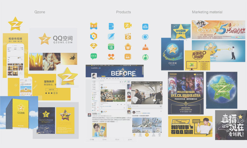
QQ空间是中国最活跃的社交网络之一,是QQ用户的网上家园,是腾讯集团的核心平台之一。为了提升在业内同行中的竞争优势,QQ空间推出了整体的品牌更新。这次任务的目标是完善和重新定义整个品牌,包括统一的视觉语言和相关的用户服务体验。
Qzone is one of the most active communities in the whole industry in China. Since 2016, to gain a competitive edge over industry peers, Qzone introduced an overall brand renewal. The task was to refine and redefine the entire brand, including the Qzone brand image, the unified visual language, and the related user experience.
设计策略Design Strategy
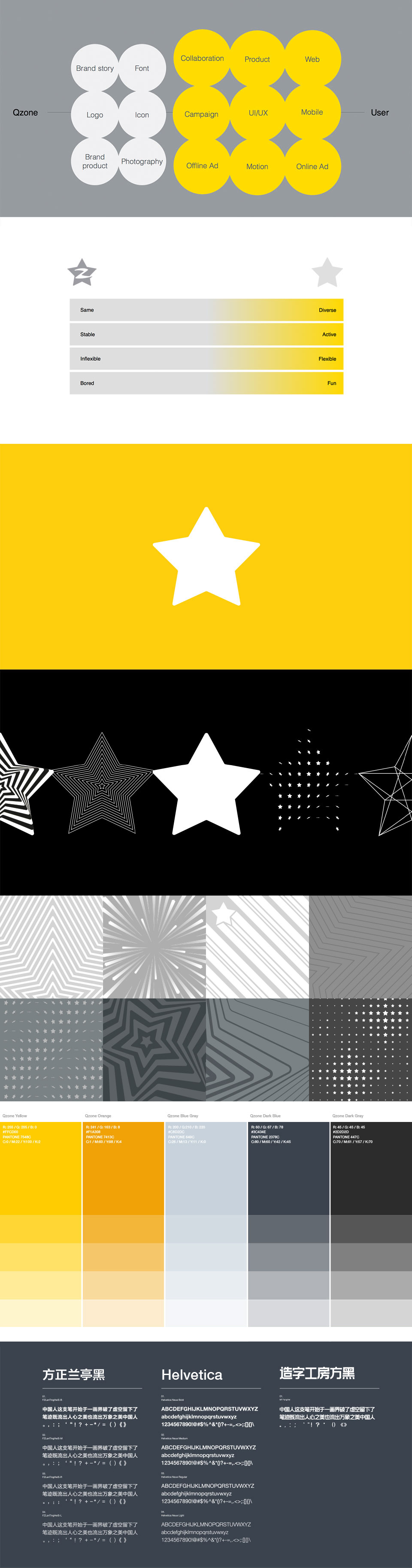
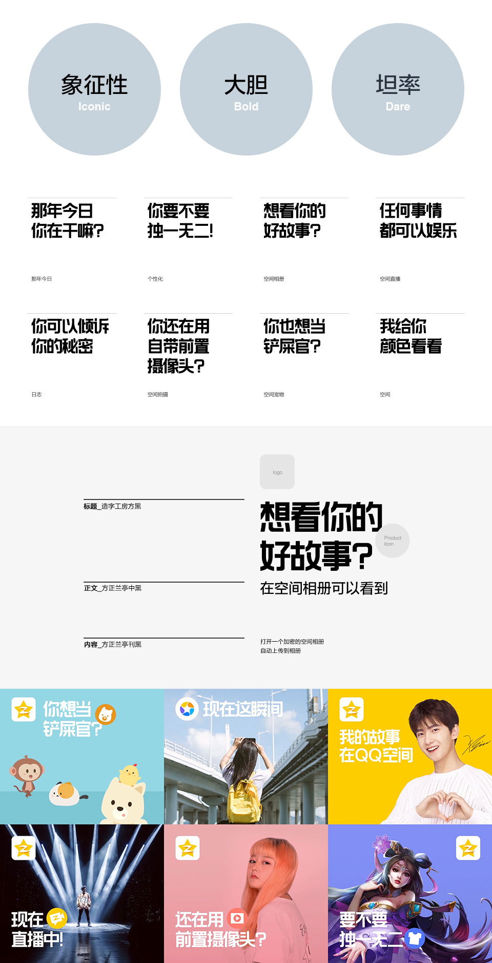
它的重点不仅在于空间新形象的创造,而且在于目前品牌形象感受的保持。星星的外形确实给了我们挑战,因为本身的形状已经很复杂,所以添加另一个元素的确很勉强。经过大量的试验,我们决定使用原来的星星形象,摒弃不必要的元素。最后,呈现多样、灵活、 现代、有趣的品牌特征。
It was important to create the new images of Qzone but also to maintain the current Qzone brand asset. The ‘Star’ shape itself was already too specific, so it was really awkward to add other elements. After lots of trials, We just decided to use star shape itself rather than adding unnecessary elements. Finally, various patterns were designed by only using the star shape and those patterns add diversity, flexibility, modernity, and fun to the brand.
方法The Formula
QQ空间的新视觉语言,使品牌更具表现力和吸引力。我们将对象 颜色 纹样组合成一个无限的公式,通过改变这些元素的成分比例,创造出新的、令人兴奋的、不偏离品牌的结果。
Qzone\’s new visual language enables the brand to be more expressive and attractive. From a consistent formula: Object Color Pattern, the combinations are almost limitless. By mixing, changing the proportions of our brand ingredients, Qzone can always create new and exciting results without deviating from the brand.
图标Iconography
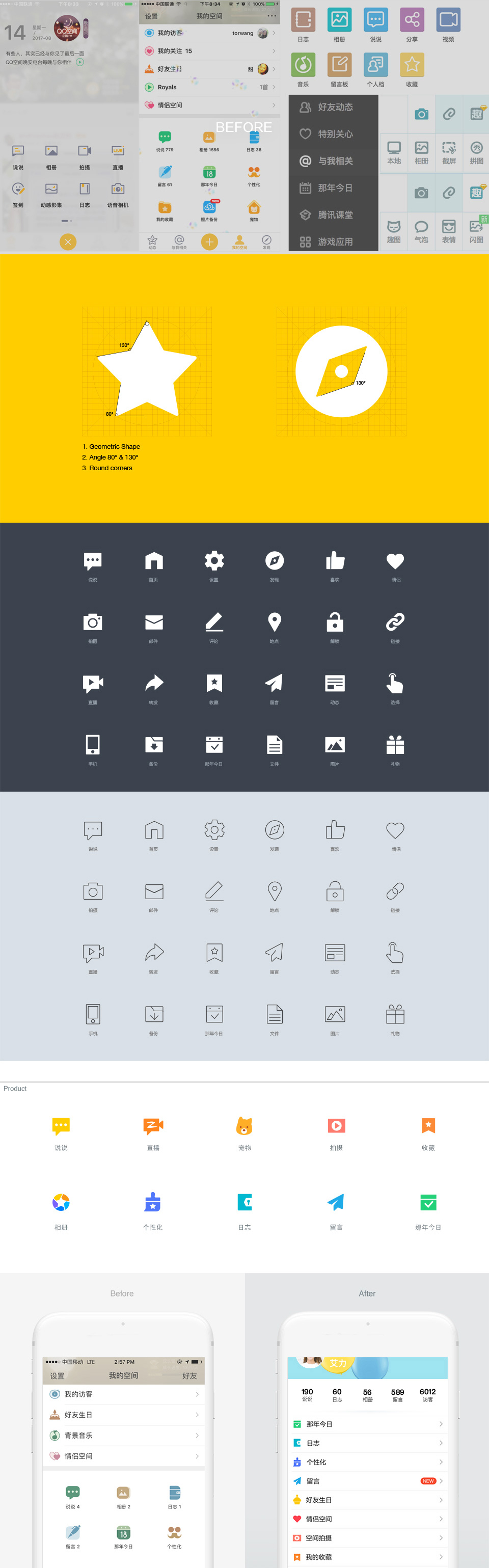
QQ空间有很多子品牌。我们重新设计了所有子品牌的logo以及规范子品牌的图标。图形元素从星形状提取,作为基础符号语言运用在每个产品的图标上,同时保持空间品牌特色的完整性。
Qzone has lots of sub-products. We also redesigned Qzone sub-products icon that followed newly developed guidelines. Icon elements are also extracted from the Qzone star shape. Every product icon has been given efficient symbol while maintaining the integrity of the Qzone brand asset.
品牌语言Brand Voice
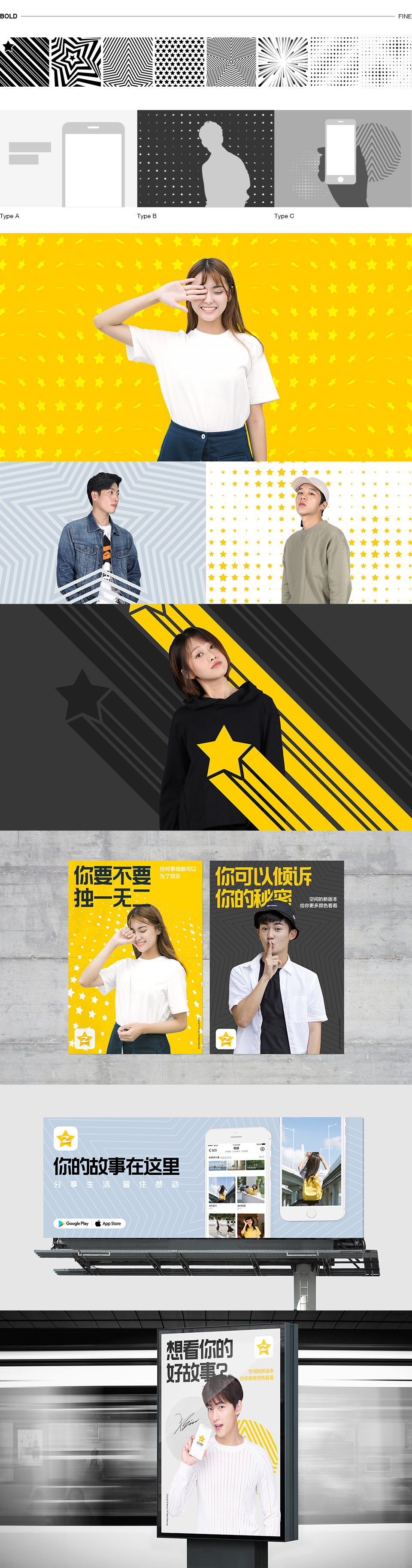
制定品牌语言系统是与用户沟通的关键。 因此,我们把品牌的语言从一个复杂的会话简化成为熟悉的、有乐趣的、迎合QQ空间年轻用户的语言。
Formalizing a system of brand language is crucial to communicate with users. Therefore, we transformed the brand voice from expository and complicated to one more conversational, familiar and fun, to cater to the predominantly younger demographic of Qzone users.
广告视频Promotion Video
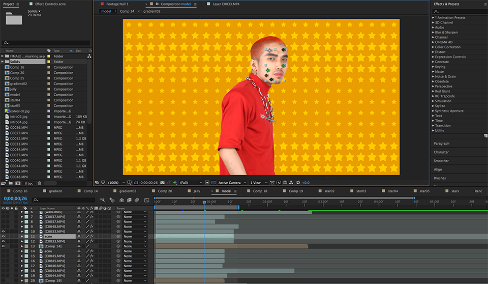
广告视频是推广我们的新品牌形象的重要渠道。我们通过视频更直观的传达空间的品牌故事。视频里的模特选用了空间员工,他们代表了QQ空间的年轻用户。同时,我们运用了许多丰富的动画模式。
It is important to promote our new brand images to the audience. Our brand story was brought to life and communicated easily via video. Our internal staff modeled as a representative of the young users of Qzone. Moreover, a wide variety of motion was tested so the pattern could be shown more vibrantly to users.
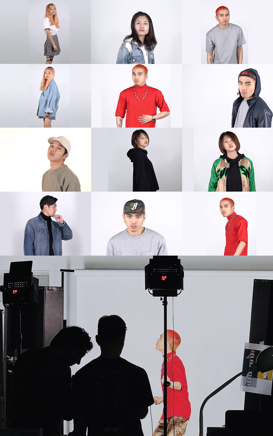
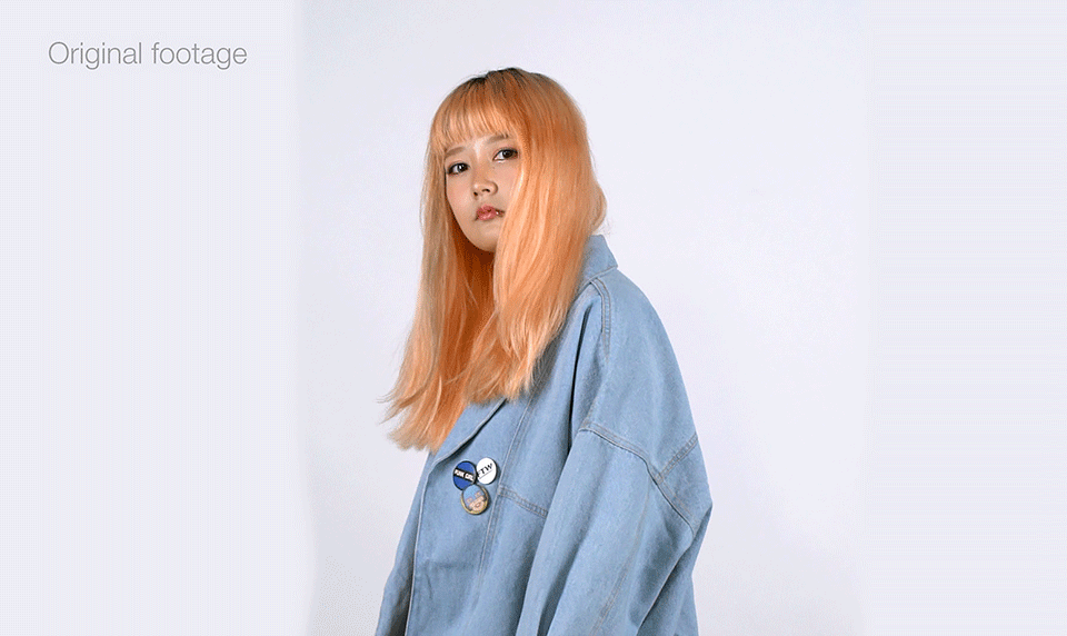
这是一些制作过程。Process of making a promotion video.


最后,我们完成了广告视频,包含了QQ空间所有的品牌故事和设计语言。
As a result, we completed our promotion video containing all new brand asset of Qzone.
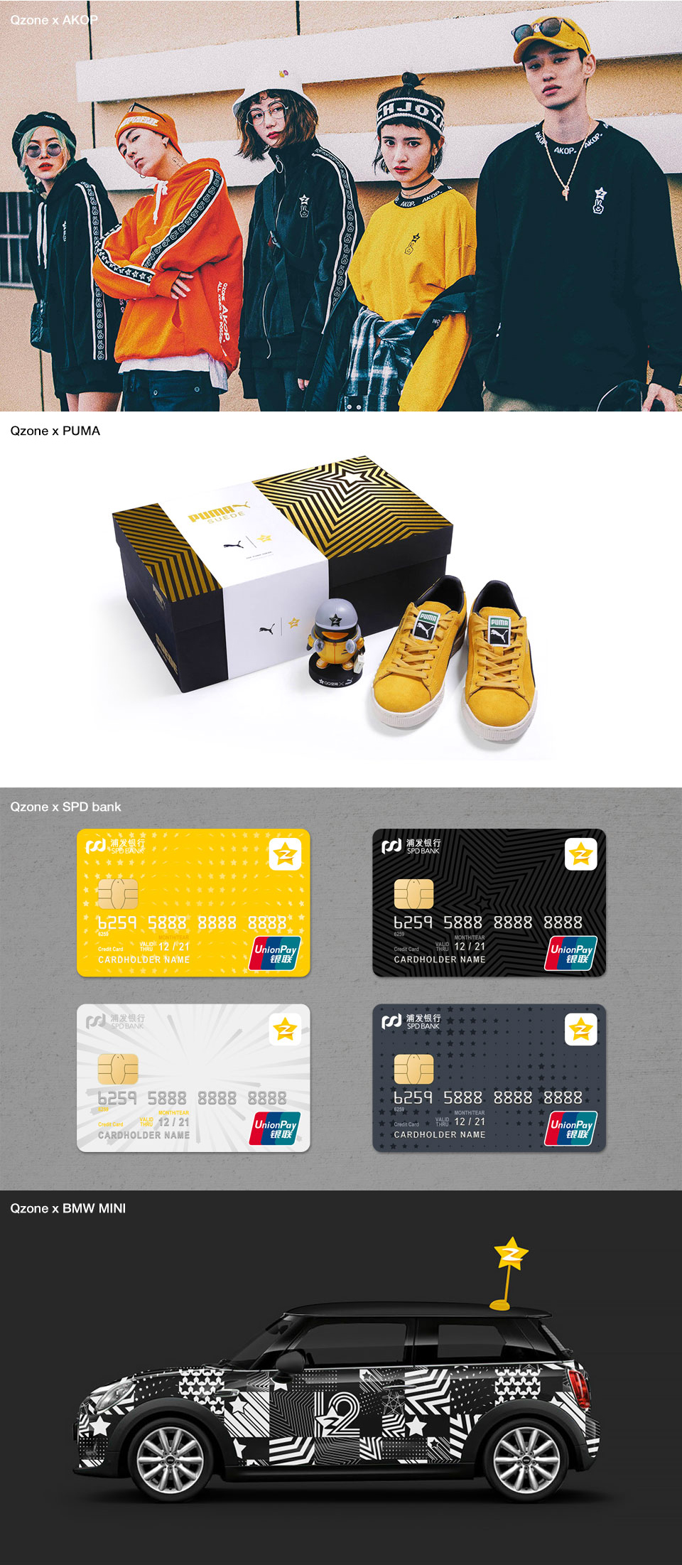
In 2018
自品牌更新以来,QQ空间开始和更多的品牌进行合作。 新的品牌形象让用户感受到新鲜、有趣和酷。而多样化的品牌语言,创造了更多QQ空间与年轻人的沟通方式。
After releasing our new brand look, Qzone was able to collaborate with many other brands. Our new Qzone brand image has integrated the Qzone approaches and facilitates interaction with users more actively through any medium and any channel.
![印刷平面设计超级大礼包合集样机下载 [购物袋/包装/礼品盒 PSD,112GB]](https://static.yrucd.com/wp-content/uploads/2020/03/0--300x200.jpg)

![C4D+AE打造的汽车结构分解动画工程模板下载[C4D,AEP]](https://static.yrucd.com/wp-content/uploads/2017/03/qc4db20170330-1.gif?x-oss-process=style/s1)
![Astute Graphics Plugins Bundle AI创意插件合集MAC版[刘兵克 常用的工具]](https://static.yrucd.com/wp-content/uploads/2016/11/Untitled-2.png?x-oss-process=style/s1)