UX设计师必看:“心理学在设计”中的5个关键课程可以帮助您提升用户体验(UX体验) 5 key lessons from “Psychology in Design” to help you advance UX
UX设计(用户体验设计)是当下最火的设计职业之一了,如果你说你是UX设计师,那些招聘的企业都会高看你一眼,今天分享的心理学在设计”中的5个关键课程可以帮助您提升用户体验 ,是UX设计师需要留意的一些心法,虽然是翻译的,但是也简单易懂,希望能给您一些帮助,enjoy!
图片来源: Google 搜索
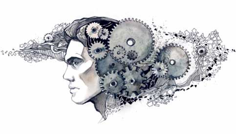
有些人经常将设计误认为是创造力。然而,设计不仅仅是将其描述为创造力的唯一结果。优秀的UX设计师往往是人类思想的伟大读者,他们了解用户如何看待设计并将其分类为好或坏。
加州大学设计实验室主任唐诺曼在他的书“日常思维的设计”中用这句话描述了这个类比:
“我们必须按照他们的方式为人们设计,而不是我们希望他们的方式。世界上有一半人口低于平均水平。“
作为设计师,了解用户构建解决问题的解决方案的痛点至关重要。该过程包括了解用户行为并强调他们创建一个可提高生产力的平台。
为了帮助您理解用户的感知,我们在这里提到了从“设计心理学”原则中提取的5个关键课程。我们开始吧!
Some people often mistake design as the creativity. However, there is more to design than just describing it as the sole result of the creativity. Great UX designers are often great readers of human mind. They understand how users perceive a design and classify it into good or bad.
Don Norman, Director of The Design Lab at the University of California, describes this analogy in his book “The Design of Everyday Thinking” with the quote:
“We must design for the people the way they are, not the way we wish them to be. Also see “Don’t be logical”. Half the people in the world are below average.”
As designers, it becomes crucial to understand the pain-points of our users to build solutions that resolve their problems. The process includes understanding user behaviours and empathising with them to create a platform that increases their productivity.
To help you understand the perception of a user, here we are mentioning 5 key lessons which are extracted from the “Psychology of Design” principles. Let’s dive in!
UX设计注重“少就是多”,“多是少” Focus on “LESS is More” and “More is LESS” in UX Design
想象一下,去一家餐馆,从超过100种菜单中选择。阅读所有可用选项所需的时间比从所选的20个项目中选择要长。设计也是如此。
大多数UX设计师对用户设计的一般概念是为用户提供可供选择的有吸引力的选项。毫无疑问,人们喜欢做出选择,但有太多选择可能会让您的用户感到困惑。一般人类的头脑可以一次处理有限数量的信息。
这与希克斯法有关,根据该法,如果人们有更多的选择,他们会花更多的时间做出选择。无论他们是有意识还是无意识地意识到这一点,人们做出的决定都受到他们认为“值得”的影响。他们不仅权衡了成本,而且也决定了影响他们采取行动的好处。这被称为“成本效益分析”。
Imagine going to a restaurant and choosing from a menu of over 100 items. Reading through all the available options is going to take longer time than choosing from the selected 20 items. Same goes with designing.
One general conception which most UX designers have towards user design is to present your users with amazing options to choose from. While there is no doubt that people love to make a choice but having too many options can make your users confused. An average human mind can process limited amount of information at a single time.
This relates to Hicks Law, according to which people spend more time in making choices if they are provided with greater number of choices. It doesn’t matter whether they are consciously or subconsciously aware of it, the decisions made by people are highly influenced by what they think are “worth” it. Not only they weigh the cost, but it is also the benefit of the decision that Influence them to take it. This is referred to as “Cost-benefit Analysis”.
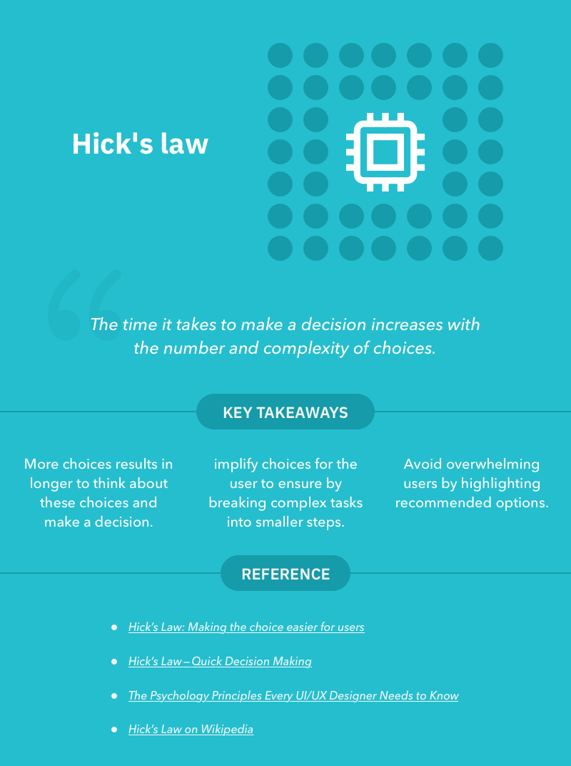
那么如何将Hick定律应用于您的产品设计?
嗯,只有一个简单的规则。设计师应该记住,用户只有达到特定目标才能到达您的网站。不要通过提供充足的选择来混淆它们。删除任何类型的高亮,不必要的链接,文本,图像和按钮,以使他们能够找到他们需要的东西,并让他们尽快完成动作,不会有任何干扰。一个有经验的法则是将复杂的流程分解为更简单和可管理的流程。通过提供清晰的路径让您的用户无缝导航,并尽早激发Aha(惊喜)时刻!
So how do you apply Hick’s law to your product design?
Well, there is only one simple rule. Designers should keep in mind that users only arrive at your website with a specific goal. Don’t ever confuse them by providing ample of choices. Remove any kind of over highlights, unnecessary links, texts, images and buttons to allow them to find what they need and make them do the action as quickly as possible without any distractions. A rule of thumb is to break down complex processes into simpler and manageable processes. Make your user navigate seamlessly by offering clear paths and spark the Aha moment as early as possible!
保留最重要的信息 Keep the most important information above the fold
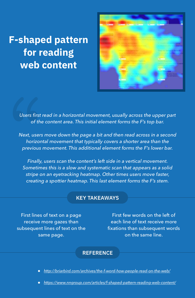
根据眼动追踪研究,大多数用户习惯于以类似的眼睛注视模式在网络上消费内容。研究表明,大多数网页热图代表了访客集中注意力的地方以及他们注视特定点的时间。
最常见的图案之一,通常形成“F”形状,相当于较短的阅读跨度。用户首先扫描屏幕顶部的水平线,从而稍微向下移动页面并读取覆盖短区域的水平线。
根据Nielsen Norman Group的一项研究,该研究是在一个45,237页面浏览量的网页上完成的,人们往往只阅读页面上大约20%的文本。更糟糕的是,在内容更多的网站上,人们每增加100个单词的文字仅需要额外的4秒钟。
那么,UX设计师如何在他们的用户体验策略中利用这一点?那么,人们应该将关键重要信息放在大多数扫描点上,并尝试使用较短但引人注目的标题来吸引用户的注意力。
在人们不逐字逐句阅读的世界中,尼尔森诺曼对可扫描文本采用以下指南。
- 突出显示的关键字
- 有意义的副标题
- 项目符号列表
- 每个段落一个想法
- 倒金字塔风格 – 从结论开始
- 传统写作的一半(或更少)字数
Most users are habitual of consuming the content on the web in similar eye-gazing patterns, according to the eye-tracking studies. The studies reveal that most web page heatmaps represents where the visitor concentrated their gaze and how long they gazed at a given point.
One of the most common patterns which usually forms a “F” shape which amounts for their shorter reading span. Users first scan a horizontal line on the top of the screen thereby moving down the page a bit and reading across the horizontal line which covers a short area.
According to a study by Nielsen Norman Group, which was done on a webpage of 45,237 page views, people tend to read only about 20% of the text on a page. Worse, on sites with more content, people dedicated only about 4 extra seconds for each additional 100 words of text.
So, how UX Designers could utilize this in their UX strategy? Well, one should place the information of the key importance in most scanned spots and try to use shorter but catching headlines to draw users attention.
In a world where people don’t read word-for-word, Nielsen Norman employs the following guidelines for scannable text.
- Highlighted keywords
- Meaningful subheadings
- Bulleted lists
- One idea per paragraph
- The inverted pyramid style — start with the conclusion
- Half the word count (or less) of conventional writing
在设计中使用颜色要谨慎 Use colors carefully in your Design
颜色是帮助人们识别和区分类似物体的好要素。在心理上,色彩是驱使人类产生情感的因素。人类的大脑使用大脑的视觉系统来感知或创造颜色,这意味着颜色本质上是主观的而不是客观的。
设计师通常使用颜色作为吸引用户注意力的重要方面。它为他们提供了一种与产品品牌联系的方法。大多数用户的购买时机和决定在很大程度上取决于颜色。
但是,色彩心理学如何帮助设计师创造更好的用户体验策略呢?
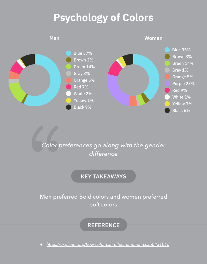
根据Azure的主要设计经理Joe Hallock的说法,性别的颜色偏好之间存在显着差异。男性和女性中最有利的颜色是蓝色,橙色是最不利的。此外,男性通常喜欢大胆的颜色,女性更喜欢柔和的颜色。
这些发现清楚地表明了为什么蓝色是设计师最喜欢的颜色,以及为什么使用橙色最少。但是,人们不仅应该根据喜好使用颜色,还应该根据用户行为和偏好使用颜色。(在咋们国家却是反的)
Colors are the beautiful things that helps people to identify and differentiate similar objects. Psychologically, colors are what drive humans with emotions. A human mind perceive or create colors using the visual system of the brain, which means colors are subjective in nature instead of objective.
Designers generally use color as an important aspect to grab the attention of a user. It gives them a way to make connection with the branding of the product. Most of the user’s purchase timing and decision largely depends on color.
But, how can the psychology of color help a designer to create a better UX strategy?
According to Joe Hallock, (Principle Design Manager at Azure), there is a significant difference between color preferences of genders. The most favorable color among both Men and Women is Blue and Orange was the least favorable. Moreover, bold colors are usually preferable by Men and soft colors are preferable by women.
These findings make it clear as to why blue is the most loved color by Designers and why Orange is used the least. However, one should not only use the colors as per likeability but also by the user-behavior and preferences.
清楚地传达哪些部分是相关的,哪些部分不相关 Convey it clearly which sections are related and which are not
在设计时,设计师通过显示哪些元素相互关联或彼此不相关来传达组织和关联更有意义。可以通过使用诸如形状,颜色和尺寸的基本元素来实现关系(或相似性)或不相关(差异)。
例如,沙龙(旧)网站由两个部分组成,按其相对大小分组。
While designing, it makes more sense for a designer to convey organizations and associations by showing which elements are related, or not related to each other. The relation (or similarity) or irrelation (difference) can be achieved by using basic elements such as shapes, colors and sizes.
For instance, the salon’s (older) site consists of two sections which are grouped by their relative sizes.
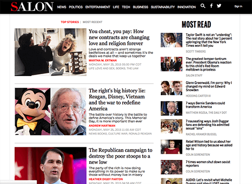
在这里,用户可以清楚地看到两个独立的组,左边是Top故事,右边是大多数。虽然这两个组都做同样的事情,即展示文章。但是,通过将Top stories组作为较大的组,并以不同的颜色显示作者名称,使用户可以专注于它。
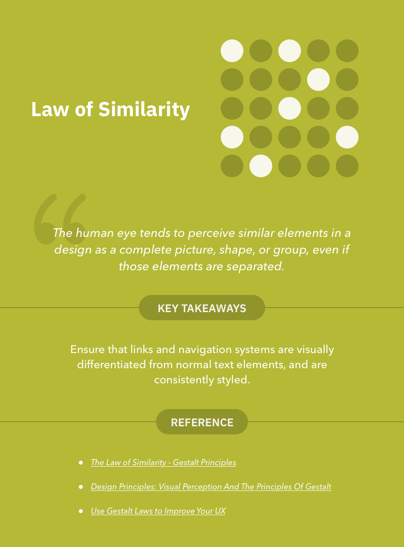
这与相似定律有关,这意味着人眼倾向于将设计中的相似元素视为完整的图像,形状或群体,即使这些元素是分开的。
Here, users can clearly perceive two separate groups which are Top stories in the left and most read in the right. Although, both of these groups does the same thing i.e displaying articles. But, by making Top stories group as the bigger one and showing the author name with different color make users to concentrate on it.
This relates to the law of similarity which means the human eye tends to perceive similar elements in a design as a complete picture, shape, or group, even if those elements are separated.”
如果上面的例子仍然没有说服你,那么让我们看看如何在设计中使用相似定律来传达关系。
If the above example still doesn’t convince you, let’s look at how law of similarity can be used in design to convey relationships.
链接和导航 Links and Navigation
链接和导航是为用户快速浏览网站的最常用方法。通常,读者不会通读整个页面来查找他们正在寻找的内容。他们试图通过链接或使用导航来查找相关信息。
设计师有意或无意地使用相似定律作为他们日常的网页设计套路。相似性规则适用于为什么这么多设计师喜欢使用蓝色下划线链接,或者至少使所有链接看起来彼此不同且和谐的事实。
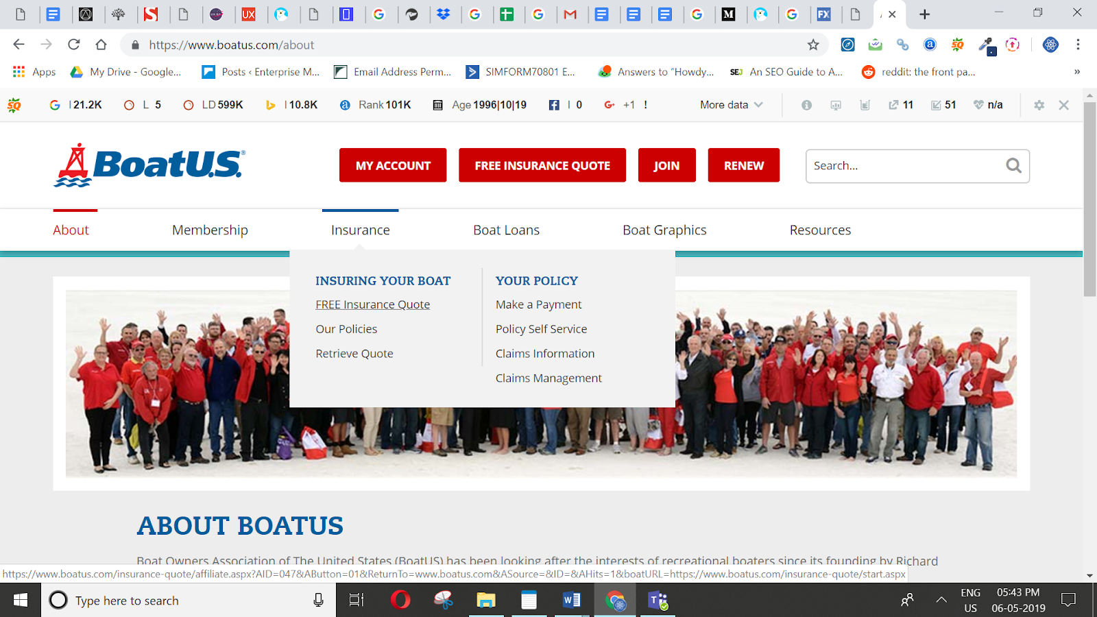
美国船主协会(BoatUS)的官方网站使用下划线和颜色来描述导航链接组之间的关系。这允许读者将类似的导航项感知为在站点的数据层次结构中相关或具有类似的位置。
Links and Navigation are most common ways to quickly navigate a site for your users. Often, readers won’t read through an entire page to find out what they are looking for. They try to find the relevant information by going through link by link or by using the navigation.
Designers use the law of similarity knowingly or unknowingly as their daily ritual of web design. The similarity rule applies to the fact why so many designers prefer to use blue, underlined links, or at least have all the links appear distinct and same as each other.
The official site of Boat Owners Association of The United States (BoatUS) use underlines and colors to depict the relationship between the group of navigation links. This allows readers to perceive similar navigation items as being related or having a similar place in the site’s data hierarchy.
通过对类似的事物进行分组并拆分不同的东西来消除您的视觉层次结构的混乱 De-clutter your Visual hierarchy by grouping similar things and split-up different things
与我们的应用程序开发人员合作过的大多数客户说“我们希望干净,直观的应用程序设计给用户留下深刻印象”。
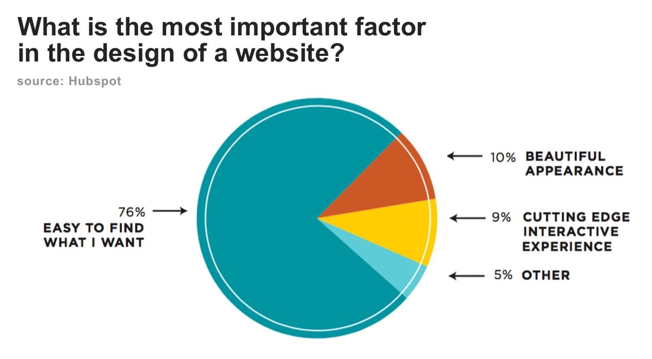
用户不喜欢混乱的设计。 Hubspot组织的一项调查显示,“访客非常重视信息,而不仅仅是漂亮的设计或好的用户体验”。
Most of the clients with whom our app developers have worked with say “We want clean and intuitive app designs that impresses the user”.
Users don’t like cluttered designs. A survey organized by Hubspot says “ visitors value easy to find information more than beautiful design or fancy UX”.
设计师应该通过组织和分组类似的元素,信息或内容来消除他们的布局。正确使用这些元素将对用户体验和用户体验产生积极影响。
这涉及“邻近法则”,其规定相关的元素应彼此保持接近,而不相关的元素应与相关元素保持进一步或分开。
Designers should de-clutter their layouts by organizing and grouping similar elements, information or content. The correct use of these elements will have a positive impact on user-experience and user-experience.
This relates to the “law of proximity” which states that elements that are related should be kept close to each other, whereas the elements that are unrelated should be kept further or apart from related ones.
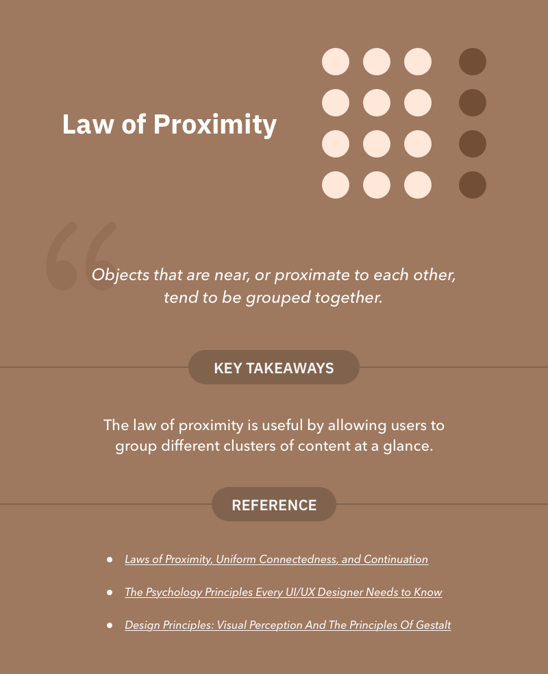
设计师可以通过两种方式使用 相邻法则 增强可用性: There are two ways using which Designers can enhance usability using law of Proximity:
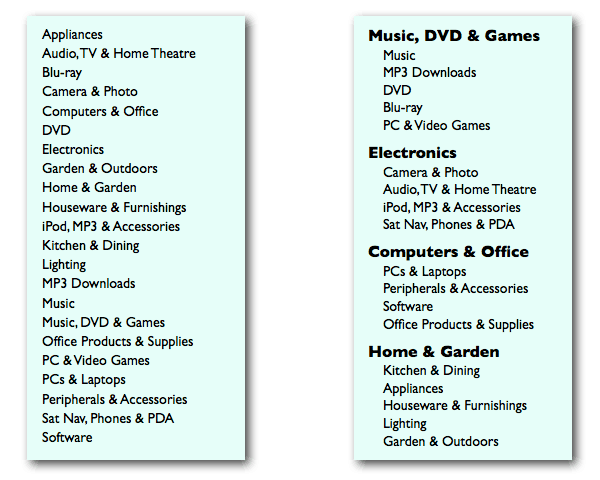
帮助您的用户找到他们正在寻找的东西:您是否碰巧偶然发现在这里和那里传播杂乱类别的网站。对于一个实例(见下图),请说您的用户希望看到
1.您网站上不同的可用PC和笔记本电脑的范围。如果您希望他们轻松找到类别,那么在专用于“Computers&Office”的界面的一部分中将其他相关项目分组比较明智,而不是提供下面显示的杂乱的类别(左侧)。
Help your users to find what they are looking for : Have you ever happened to stumble upon websites that have cluttered categories spread here and there. For an instance (see image below), say your users are looking to see the range of
1. different available PCs and laptops on your website. If you want them to easily find the category, it’s wiser to group other related items in a part of the interface devoted to “Computers & Office” as compared to provide disorganized mess of categories shown below (left side).
2.构建元素的可视化层次结构,以帮助人们了解界面的结构:构建可视层次结构,如字体层次结构,颜色层次等,可以帮助设计人员甚至非设计人员构建美观且吸引人的设计正确的关注。这是一个有趣的阅读,让您了解构建视觉层次结构:每个非设计师需要知道的12个可视层次结构原则。
2. Build a visual hierarchy of elements to help people get an idea of how the interface is structured : Building visual hierarchies like Typefaces hierarchy, hierarchy of colors etc. can help designers or even non-designers to compose designs that are aesthetically pleasing and attract the right attention. Here’s an interesting read to make you aware on building visual hierarchies: 12 Visual Hierarchy Principles Every Non-Designer Needs to Know.
提升您的UX设计游戏水平 Levelling up your game of UX design
有一种说法“如果一切都很突出,那么没有什么突出的。”这也适用于用户体验设计。设计师不应该通过设计看起来漂亮的东西来欺骗用户。事实上,他们必须考虑用户的需求而设计。在本文中,我们已经解释了5种心理学原理,可以帮助您提升设计游戏水平。
您最熟悉的心理学原则是什么?你觉得哪一个最棘手?请在评价部分留下您的意见。
There is a saying “If everything stands out, then nothing stands out.” This applies to UX design too. Designers should not fool the users by designing things that look beautiful. In fact, they must design considering their users need in their mind. In this article, we have explained 5 psychology principles that can help you to level up your design game.
What psychology principles are you most comfortable employing in your designs? and Which one you find the trickiest of all? Let us know in the comments section.
![印刷平面设计超级大礼包合集样机下载 [购物袋/包装/礼品盒 PSD,112GB]](https://static.yrucd.com/wp-content/uploads/2020/03/0--300x200.jpg)
![股票理财类数据展示APP UI KITS套装[Sketch]](https://static.yrucd.com/wp-content/uploads/2017/12/kkkbanner1228-300x220.gif)
![时尚好用的PPT模版打包下载[100多种排版,powerpoint和keynote共用]](https://static.yrucd.com/wp-content/uploads/2016/10/pptPower.jpg?x-oss-process=style/s1)

![回宫格样式的英文字体下载[otf]](https://static.yrucd.com/wp-content/uploads/2016/12/hg.jpg?x-oss-process=style/s1)