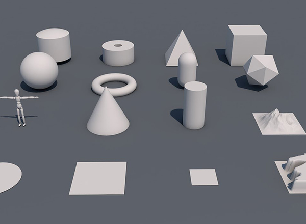
10个给您带来灵感的HTML5网页进度条代码下载
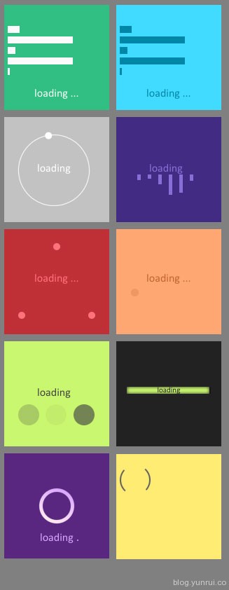
今天给大家分享一批由HTML5实现的网页进度条,设计得很前卫,无需JS,从这里也展示了HTML5的强大的动画功能,期待HTML5早日全线普及。效果品种有,条形进度条、圆形进度条和其他新颖的形式,所以喜欢HTML5的同学必须拥有,我们这里提供了全套的代码下载,下载地址在底部,enjoy!
相关代码如下:
一、HTML代码:
<!DOCTYPE html>
<html>

<head>

  <meta charset="UTF-8">

  <title>Progress bar/Loader - CodePen</title>

    <link rel="stylesheet" href="css/style.css" media="screen" type="text/css" />

</head>

<body>

  <div id="caseVerte">
  <div id="case1"></div>
  <div id="case2"></div>
  <div id="case3"></div>
  <div id="case4"></div>
  <div id="case5"></div>
  <div id="case6"></div>
  <div id="load">
  <p>loading ...</p>
  </div>
</div>
<div id="caseBleu">
  <div id="case1"></div>
  <div id="case2"></div>
  <div id="case3"></div>
  <div id="case4"></div>
  <div id="case5"></div>
  <div id="case6"></div>
  <div id="load">
  <p>loading ...</p>
  </div>
</div>
<div id="caseRouge">
  <div id="load">
      <p>loading ...</p>
  </div>
  <div id="top"></div>
  <div id="left"></div>
  <div id="right"></div>
</div>
<div id="caseMarron">
  <div id="boule"></div>
  <div id="load">
  <p>loading ...</p>
  </div>
</div>
<div id="caseViolette">
  <div id="cercle">
     <div id="cercleCache"></div>
  </div>
  <div id="load">
    <p>loading</p>
  </div>
  <div id="point"></div>
</div>
<div id="caseBlanche">
  <div id="rond">
    <div id="test"></div>
  </div>
  <div id="load">
    <p>loading</p>
  </div>
</div>
<div id="casePourpre">
  <div id="load">
    <p>loading</p>
  </div>
  <div id="vague">
    <div id="vague1"></div>
    <div id="vague2"></div>
    <div id="vague3"></div>
    <div id="vague4"></div>
    <div id="vague5"></div>
    <div id="vague6"></div>
  </div>
</div>
<div id="caseVerteClaire">
  <div id="transform">
    <div id="transform1"></div>
    <div id="transform2"></div>
    <div id="transform3"></div>
  </div>
   <div id="load">
    <p>loading</p>
  </div>
</div>
<div id="caseGrise">
  <div id="progress">
    <div id="charge"></div>
  </div>
  <div id="load">
    <p>loading</p>
  </div>
</div>
<div id="caseMarronFonce">
  <div id="spinner"></div>
</div>
</body>

</html>
二、CSS代码:
body {
  background-color : grey;
}

div {
  margin : 5px;
}

#caseVerte {
  background-color : #30bf82;
  height : 140px;
  width : 150px;
  padding-top : 10px;
  float :left;
}

#caseBleu {
  background-color : #40dbff;
  height : 140px;
  width : 150px;
  padding-top : 10px;
  float : left;
}

#caseRouge {
  background-color : #bf3037;
  height : 140px;
  width : 150px;
  padding-top : 10px;
  float : left;
  position : relative;
}

#caseMarron {
  background-color : #ffa773;
  height : 140px;
  width : 150px;
  padding-top : 10px;
  float : left;
  position : relative;
}

#caseViolette {
  background-color : #592780;
  height : 140px;
  width : 150px;
  padding-top : 10px;
  float : left;
  position : relative;
}

#caseBlanche {
  background-color : #C2C2C2;
  height : 140px;
  width : 150px;
  padding-top : 10px;
  float : left;
  position : relative;
}

#casePourpre {
  background-color : #422c83;
  height : 140px;
  width : 150px;
  padding-top : 10px;
  float : left;
  position : relative;
}

#caseVerteClaire {
  background-color : #C9F76F;
  height : 140px;
  width : 150px;
  padding-top : 10px;
  float : left;
  position : relative;
}

#caseGrise {
  background-color : #222222;
  height : 140px;
  width : 150px;
  padding-top : 10px;
  float : left;
  position : relative;
}

#caseMarronFonce {
  background-color : #FFEC73;
  height : 140px;
  width : 150px;
  padding-top : 10px;
  float : left;
  position : relative;
}

#caseVerte #load {
  color : #fbfbfb;
  font-family : calibri;
  text-align : center;
}

#caseBleu #load {
  color : #0086a6;
  font-family : calibri;
  text-align : center;
}

#caseRouge #load {
  color : #ff737a;
  font-family : calibri;
  text-align : center;
  margin-top : 50px;
}

#caseMarron #load {
  color : #bf6530;
  font-family : calibri;
  text-align : center;
  margin-top : 50px;
}

#caseViolette #load {
  color : #D8A6FF;
  font-family : calibri;
  text-align : center;
  margin-top : 100px;
}

#caseBlanche #load {
  color : #fff;
  font-family : calibri;
  text-align : center;
  position : absolute;
  top : 42px;
  left :42px;
}

#casePourpre #load {
  color : #886ed7;
  font-family : calibri;
  text-align : center;
  position : absolute;
  top : 42px;
  left :42px;
}

#caseVerteClaire #load {
  color : #444444;
  font-family : calibri;
  text-align : center;
  position : absolute;
  top : 42px;
  left :42px;
}

#caseGrise #load {
  color : #222;
  font-family : calibri;
  text-align : center;
  position : relative;
  top : 42px;
  font-size : 11px;
}

/****DEBUT CASE 1****/
#caseVerte #case1 {
  height  : 10px;
  width : 100px;
  background-color : #fbfbfb;
  animation : case1 2.25s infinite;
  -webkit-animation : case1 2.25s infinite;
}

#caseBleu #case1 {
  height  : 10px;
  width : 100px;
  background-color : #0086a6;
  animation : case1 2.25s infinite;
  -webkit-animation : case1 2.25s infinite;
}

@-webkit-keyframes case1 {
  0% {width : 0%;}
  50% {width : 90px;}
  100% {width : 0%;}
}

@keyframes case1 {
  0% {width : 0%;}
  50% {width : 90px;}
  100% {width : 0%;}
}
/****FIN CASE 1****/

/****DEBUT CASE 2****/
#caseVerte #case2 {
  height : 10px;
  width : 10px;
  background-color : #fbfbfb;
  animation : case2 2s infinite;
  -webkit-animation : case2 2s infinite;
}

#caseBleu #case2 {
  height : 10px;
  width : 10px;
  background-color : #0086a6;
  animation : case2 2s infinite;
  -webkit-animation : case2 2s infinite;
}

@-webkit-keyframes case2 {
  0% {width : 0%;}
  50% {width : 100px;}
  100% {width : 0%;}
}

@keyframes case2 {
  0% {width : 0%;}
  50% {width : 100px;}
  100% {width : 0%;}
}
/****FIN CASE 2****/

/****DEBUT CASE 3****/
#caseVerte #case3 {
  height : 10px;
  width : 10px;
  background-color : #fbfbfb;
  animation : case3 1.75s infinite;
  -webkit-animation : case3 1.75s infinite;
}

#caseBleu #case3 {
  height : 10px;
  width : 10px;
  background-color : #0086a6;
  animation : case3 1.75s infinite;
  -webkit-animation : case3 1.75s infinite;
}

@-webkit-keyframes case3 {
  0% {width : 0%;}
  50% {width : 95px;}
  100% {width : 0%;}
}

@keyframes case3 {
  0% {width : 0%;}
  50% {width : 95px;}
  100% {width : 0%;}
}
/****FIN CASE 3****/

/****DEBUT CASE 4****/
#caseVerte #case4 {
  height : 10px;
  width : 10px;
  background-color : #fbfbfb;
  animation : case3 2.5s infinite;
  -webkit-animation : case3 2.5s infinite;
}

#caseBleu #case4 {
  height : 10px;
  width : 10px;
  background-color : #0086a6;
  animation : case3 2.5s infinite;
  -webkit-animation : case3 2.5s infinite;
}

@-webkit-keyframes case4 {
  0% {width : 0%;}
  50% {width : 80px;}
  100% {width : 0%;}
}

@keyframes case4 {
  0% {width : 0%;}
  50% {width : 80px;}
  100% {width : 0%;}
}
/****FIN CASE 4****/

/****DEBUT CASE 5****/
#caseVerte #case5 {
  height : 10px;
  width : 10px;
  background-color : #fbfbfb;
  animation : case3 1.5s infinite;
  -webkit-animation : case3 1.5s infinite;
}

#caseBleu #case5 {
  height : 10px;
  width : 10px;
  background-color : #0086a6;
  animation : case3 1.5s infinite;
  -webkit-animation : case3 1.5s infinite;
}

@-webkit-keyframes case5 {
  0% {width : 0%;}
  50% {width : 105px;}
  100% {width : 0%;}
}

@keyframes case5 {
  0% {width : 0%;}
  50% {width : 105px;}
  100% {width : 0%;}
}
/****FIN CASE 5****/

/****DEBUT CASE 6****/
#caseVerte #case6 {
  height : 10px;
  width : 10px;
  background-color : #fbfbfb;
  animation : case3 5s infinite;
  -webkit-animation : case3 5s infinite;
}

#caseBleu #case6 {
  height : 10px;
  width : 10px;
  background-color : #0086a6;
  animation : case3 5s infinite;
  -webkit-animation : case3 5s infinite;
}

@-webkit-keyframes case6 {
  0% {width : 0%;}
  50% {width : 75px;}
  100% {width : 0%;}
}

@keyframes case6 {
  0% {width : 0%;}
  50% {width : 75px;}
  100% {width : 0%;}
}
/****FIN CASE 6****/

/****DEBUT TOP****/
#top {
  height : 10px;
  width : 10px;
  border-radius : 50%;
  background-color : #ff737a;
  position : absolute;
  top : 10px;
  left : 65px;
  animation : turnTop 2s infinite;
  -webkit-animation : turnTop 2s infinite;
}

@keyframes turnTop {
  0% {top : 10px;}
  50% {top : 40px;}
  100% {top : 10px;}
}

@-webkit-keyframes turnTop {
  0% {top : 10px;}
  50% {top : 40px;}
  100% {top : 10px;}
}
/****FIN TOP****/

/****DEBUT LEFT****/
#left {
  height : 10px;
  width : 10px;
  border-radius : 50%;
  background-color : #ff737a;
  position : absolute;
  bottom : 10px;
  left : 10px;
  animation : turnLeft 2s infinite;
  -webkit-animation : turnLeft 2s infinite;
}

@keyframes turnLeft {
  0% {bottom : 10px; left : 10px;}
  50% {bottom : 50px; left : 40px;}
  100% {bottom : 10px; left : 10px;}
}

@-webkit-keyframes turnLeft {
  0% {bottom : 10px; left : 10px;}
  50% {bottom : 50px; left : 40px;}
  100% {bottom : 10px; left : 10px;}
}
/****FIN LEFT****/

/****DEBUT RIGHT****/
#right {
  height : 10px;
  width : 10px;
  border-radius : 50%;
  background-color : #ff737a;
  position : absolute;
  bottom : 10px;
  right : 10px;
  animation : turnRight 2s infinite;
  -webkit-animation : turnRight 2s infinite;
}

@keyframes turnRight {
  0% {bottom : 10px; right : 10px;}
  50% {bottom : 50px; right : 40px;}
  100% {bottom : 10px; right : 10px;}
}

@-webkit-keyframes turnRight {
  0% {bottom : 10px; right : 10px;}
  50% {bottom : 50px; right : 40px;}
  100% {bottom : 10px; right : 10px;}
}
/****FIN RIGHT****/

/****DEBUT BOULE****/
#boule {
  height : 10px;
  width : 10px;
  position : absolute;
  top : 80px;
  left : 10px;
  background-color : #bf6530;
  border-radius : 50%;
  animation : boule 2s infinite;
  -webkit-animation : boule 2s infinite;
}

@keyframes boule {
  0% {left : 10px;opacity : 0;}
  50% {height : 20px; width : 20px; opacity : 1;}
  100% {left : 120px; opacity : 0; height : 10px; width : 10px;}
}

@-webkit-keyframes boule {
  0% {left : 10px;opacity : 0;}
  50% {height : 20px; width : 20px; opacity : 1;}
  100% {left : 120px; opacity : 0; height : 10px; width : 10px;}
}
/****FIN BOULE****/

/****DEBUT CERCLE****/
#cercle {
  height : 50px;
  width : 50px;
  position : absolute;
  top : 45px;
  left : 45px;
  border-radius : 50%;
  background : linear-gradient(#D8A6FF,#FFECEE);
  animation : turnCercle 2s infinite;
  -webkit-animation : turnCercle 5s infinite;
  animation-timing-function : ease-in-out;
  -webkit-animation-timing-function : ease-in-out;
}

@-webkit-keyframes turnCercle {
  0% {-webkit-transform : rotate(0deg);}
  100% {-webkit-transform : rotate(10080deg);}
}

@keyframes turnCercle {
  0% {transform : rotate(0deg);}
  100% {transform : rotate(10080deg);}
}

#cercleCache {
  height : 40px;
  width : 40px;
  position : absolute;
  border-radius : 50%;
  background-color : #592780;
  z-index : 5;
}
/****FIN CERCLE****/

/****DEBUT POINT****/
#point {
  height : 2px;
  width : 2px;
  position : relative;
  top : -22px;
  left : 96px;
  border-radius : 50%;
  background-color : #D8A6FF;
  animation : point 1.5s infinite;
  -webkit-animation : point 1.5s infinite;
  animation-timing-function : linear;
  -webkit-animation-timing-function : linear;
}

@-webkit-keyframes point {
  0% {left : 96px; opacity : 0;}
  5% {left : 96px; opacity : 1;}
  15% {left : 96px; opacity : 0;}
  30% {left : 99px; opacity : 0;}
  45% {left : 99px; opacity : 1;}
  60% {left : 99px; opacity : 0;}
  75% {left : 102px; opacity : 0;}
  90% {left : 102px; opacity : 1;}
  100% {left : 102px; opacity : 0;}
}

@keyframes point {
  0% {left : 96px; opacity : 0;}
  5% {left : 96px; opacity : 1;}
  15% {left : 96px; opacity : 0;}
  30% {left : 99px; opacity : 0;}
  45% {left : 99px; opacity : 1;}
  60% {left : 99px; opacity : 0;}
  75% {left : 102px; opacity : 0;}
  90% {left : 102px; opacity : 1;}
  100% {left : 102px; opacity : 0;}
}
/****FIN POINT****/

/****DEBUT TEST****/
#test {
  height : 10px;
  width : 10px;
  position : absolute;
  background-color : #fff;
  border-radius : 50%;
  top : 0px;
  left : 10px;
}

#rond {
  height  : 100px;
  width : 100px;
  border : 1px solid #fff;
  border-radius : 50%;
  position :absolute;
  top : 20px;
  left : 15px;
  animation : rond 2s infinite;
  -webkit-animation : rond 2s infinite;
}

@keyframes rond {
  0% {transform : rotate(0deg);}
  100% {transform : rotate(360deg);}
}

@-webkit-keyframes rond {
  0% {-webkit-transform : rotate(0deg);}
  100% {-webkit-transform : rotate(360deg);}
}
/****FIN TEST****/

/****DEBUT VAGUE****/
#vague {
  position : absolute;
  top : 72px;
  left : 20px;
}

#vague1 {
  height : 5px;
  width : 5px;
  background-color : #886ed7;
  float : left;
  animation : vague1 2.5s infinite;
  -webkit-animation : vague1 2.5s infinite;
}

@-webkit-keyframes vague1 {
  0% {height : 5px;}
  50% {height : 30px;}
  100% {height : 5px;}
}

@keyframes vague1 {
  0% {height : 5px;}
  50% {height : 30px;}
  100% {height : 5px;}
}

#vague2 {
  height : 5px;
  width : 5px;
  background-color : #886ed7;
  float : left;
  animation : vague2 2.5s infinite;
  -webkit-animation : vague2 2.5s infinite;
  animation-delay : 0.5s;
  -webkit-animation-delay : 0.5s;
}

@-webkit-keyframes vague2 {
  0% {height : 5px;}
  50% {height : 30px;}
  100% {height : 5px;}
}

@keyframes vague2 {
  0% {height : 5px;}
  50% {height : 30px;}
  100% {height : 5px;}
}

#vague3 {
  height : 5px;
  width : 5px;
  background-color : #886ed7;
  float : left;
  animation : vague3 2.5s infinite;
  -webkit-animation : vague3 2.5s infinite;
  animation-delay : 1s;
  -webkit-animation-delay : 1s;
}

@-webkit-keyframes vague3 {
  0% {height : 5px;}
  50% {height : 30px;}
  100% {height : 5px;}
}

@keyframes vague3 {
  0% {height : 5px;}
  50% {height : 30px;}
  100% {height : 5px;}
}

#vague4 {
  height : 5px;
  width : 5px;
  background-color : #886ed7;
  float : left;
  animation : vague4 2.5s infinite;
  -webkit-animation : vague4 2.5s infinite;
  animation-delay : 1.5s;
  -webkit-animation-delay : 1.5s;
}

@-webkit-keyframes vague4 {
  0% {height : 5px;}
  50% {height : 30px;}
  100% {height : 5px;}
}

@keyframes vague4 {
  0% {height : 5px;}
  50% {height : 30px;}
  100% {height : 5px;}
}

#vague5 {
  height : 5px;
  width : 5px;
  background-color : #886ed7;
  float : left;
  animation : vague5 2.5s infinite;
  -webkit-animation : vague5 2.5s infinite;
  animation-delay : 2s;
  -webkit-animation-delay : 2s;
}

@-webkit-keyframes vague5 {
  0% {height : 5px;}
  50% {height : 30px;}
  100% {height : 5px;}
}

@keyframes vague5 {
  0% {height : 5px;}
  50% {height : 30px;}
  100% {height : 5px;}
}

#vague6 {
  height : 5px;
  width : 5px;
  background-color : #886ed7;
  float : left;
  animation : vague6 2.5s infinite;
  -webkit-animation : vague6 2.5s infinite;
  animation-delay : 2.5s;
  -webkit-animation-delay : 2.5s;
}

@-webkit-keyframes vague6 {
  0% {height : 5px;}
  50% {height : 30px;}
  100% {height : 5px;}
}

@keyframes vague6 {
  0% {height : 5px;}
  50% {height : 30px;}
  100% {height : 5px;}
}
/****FIN VAGUE****/

/****DEBUT TRANSFORM****/
#tranform {
  position : absolute;
  top : 85px;
  left : 30px;
}

#transform1 {
  height : 30px;
  width : 30px;
  border-radius : 50%;
  background-color : #444444;
  position : absolute;
  top : 85px;
  left : 15px;
  opacity : 0;
  animation : transform 4s infinite;
  -webkit-animation : transform 4s infinite;
}

#transform2 {
  height : 30px;
  width : 30px;
  border-radius : 50%;
  background-color : #444444;
  position : absolute;
  top : 85px;
  left : 54px;
  opacity : 0;
  animation : transform 4s infinite;
  -webkit-animation : transform 4s infinite;
  animation-delay : 0.5s;
  -webkit-animation-delay : 0.5s;
}

#transform3 {
  height : 30px;
  width : 30px;
  border-radius : 50%;
  background-color : #444444;
  position : absolute;
  top : 85px;
  left : 94px;
  opacity : 0;
  animation : transform 4s infinite;
  -webkit-animation : transform 4s infinite;
  animation-delay : 1s;
  -webkit-animation-delay : 1s;
}

@-webkit-keyframes transform {
  0% {opacity : 0;}
  25% {opacity : 1;}
  50% {opacity : 0;}
  75% {opacity : 1;}
  100% {opacity : 0;}
}

@keyframes transform {
  0% {border-radius : 0px; opacity : 0;}
  20% {border-radius : 0px; opacity : 1;}
  40% {border-radius : 0px; opacity : 0;}
  60% {border-radius : 50%; opacity : 0;}
  80% {border-radius : 50%; opacity : 1;}
  100% {border-radius : 50%; opacity : 0;}
}
/****FIN TRANSFORM****/

/****DEBUT PROGRESS****/
#progress {
  height : 10px;
  width : 120px;
  position : absolute;
  top : 60px;
  left : 10px;
  box-shadow : 0px 0px 10px #111111 inset;
}

#charge {
  height : 10px;
  width : 120px;
  position : absolute;
  top : 0px;
  left : 0px;
  background-color : #C9F76F;
  margin : 0px;
  animation : charge 7s infinite;
  -webkit-animation : charge 7s infinite;
  box-shadow : 0px 0px 5px #222 inset;
}

@-webkit-keyframes charge {
  0% {width : 0px;}
  100% {width : 100%;}
}

@keyframes charge {
  0% {width : 0px;}
  100% {width : 100%;}
}
/****FIN PROGRESS****/

/****DEBUT SPINNER****/
#spinner {
  height : 40px;
  width : 40px;
  /*background-color : #61615E;*/
  border : 2px solid #61615e;
  border-left-color : transparent;
  border-right-color : transparent;
  border-radius : 50%;
  animation : spin 2s infinite;
  -webkit-animation : spin 2s infinite;
}

@-webkit-keyframes spin {
  0% {-webkit-transform : rotate(0deg);}
  50% {-webkit-transform : rotate(360deg);}
  100% {-webkit-transform : rotate(0deg);}
}

@keyframes spin {
  0% {transform : rotate(0deg);}
  50% {transform : rotate(360deg);}
  100% {transform : rotate(0deg);}
}
/****FIN SPINNER****/
下载信息
格式: HTML+JS
文件大小: 4KB
下载地址:http://pan.baidu.com/s/1ntNneuX
![云瑞收集的iPhone X和iPhone 8 展示模型Mockups 合集下载[PSD,Sketch]](https://static.yrucd.com/wp-content/uploads/2017/09/iPhoneXall0915.gif)


![印刷平面设计超级大礼包合集样机下载 [购物袋/包装/礼品盒 PSD,112GB]](https://static.yrucd.com/wp-content/uploads/2020/03/0--300x200.jpg)


![20种时尚的无缝循环纹理素材下载[EPS]](https://static.yrucd.com/wp-content/uploads/2017/04/seamlessb0417.jpg?x-oss-process=style/s1)